Prism Esports
A Fresh Rebranding for an Up and Coming Esports Organization
Overview
60%
7
100's
Background
Prism Esports is a multi-title esports organization built around a team-first culture. By the time I came in, they had teams competing across several games and a daily schedule of events, streams, and social content. Their brand had been assembled piecemeal by whoever was available, and it showed in every piece that went out.
Problem
Every designer left a different fingerprint.
Prior materials had been produced by multiple designers without a shared foundation. The result was inconsistent across every surface: logo, social graphics, in-game overlays, all with no common visual language tying any of it together. The management team couldn't keep the brand coherent day-to-day because there was nothing codified to reference. This was the equivalent of having a scratch kitchen with talented chefs and management, but the menu consisted of whatever someone wanted to cook that day. The output was great, but the patrons never knew what to expect.
Solution
Translate their vision into a creative foundation.
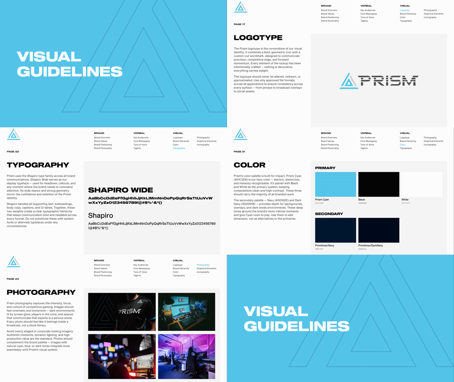
The Prism brand wasn't freshly created when I had joined. The organization, its audience, and the culture surrounding the brand were already deeply engrained and loved. So, I worked directly with the founders to understand their positioning, culture, and where they wanted to take the organization. From there, I refined and standardized their existing brand: logos, colors, typography, and guidelines the team could actually use day to day and serve their business goals, not just their aesthetic preferences.

Process
Audit. Align. Ship.
Before touching any assets, I inventoried what existed and identified what could carry forward versus what needed to go. With a direction established and guidelines in place, I moved into standardizing items within the production pipeline. A template for each item and a clear SOP was established to ensure the design and review process could work in Prism's async working culture.
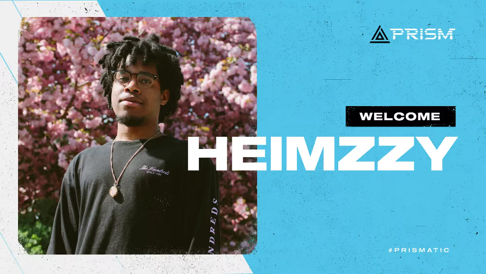
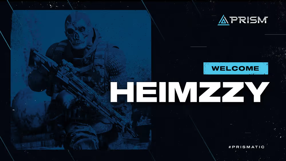
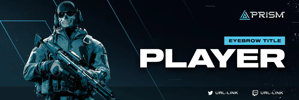
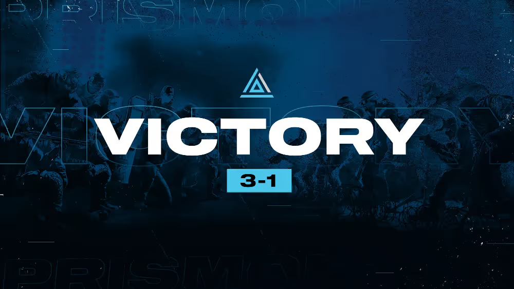
Welcome cards, match result graphics, player headers, stream overlays and other digital materials were made. Each one built to the same spec, regardless if a creative director or a junior designer was handling it.
.avif)
.avif)
Major updates
An intertwined web of events, updates, and media.
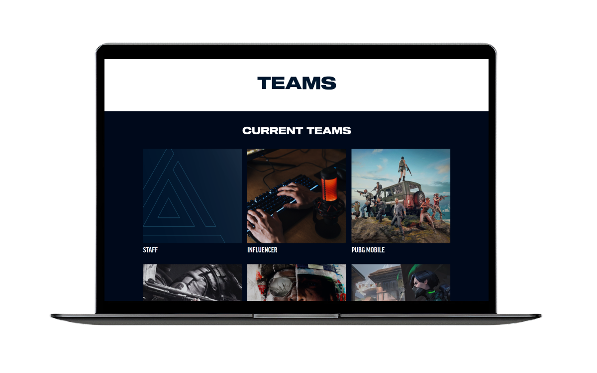
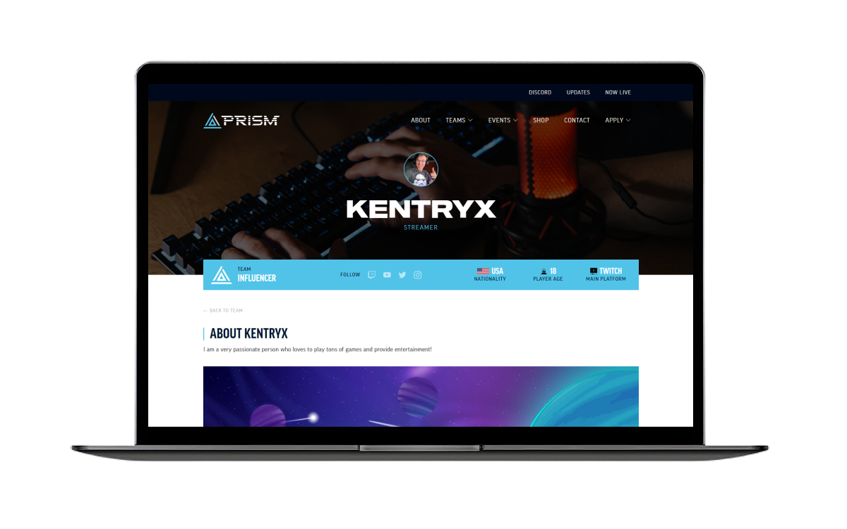
I worked closely with Prism's leadership to understand the current and future goals of the organizations esports teams. They needed a platform where they could hold all of the happenings, news, and teams online—and ensure these all could connect with each other to ensure a seamless flow of information no matter where you arrived from.
We found that a CMS managed within a custom-design Webflow site was the best approach. This allowed for the design team to retain ownership and control of the site look and feel, while organization members could update CMS databases and have them map to the site in real time.
Additional and new visual assets for the brand were created as we made our way through the website; Most notably video and photo materials of the new Prism jerseys as featured on the homepage.
.avif)
Outcome
A cohesive, unified brand on both the inside and out.
Prism launched with a coherent visual identity for the first time. The management team had a reference system they could brief against. New assets—produced in-house or externally—had a consistent foundation to build from, rather than a blank slate every time.
The team could focus and debate on the things that actually mattered, rather than getting caught up on small fry. This led to a more efficient and productive team—and as a byproduct, a happier team with a strong sense of culture than ever before.