Powerspike
Bridging advertisers with the ever-growing gaming ecosystem.
Overview
100+
$1M+
1
Background
Powerspike is an influencer marketing agency built for gaming—a platform designed to connect brands and creators without the gatekeeping that defines most of the industry. No manager required, no A-list status required. When I came in, they had the product and the mission. What they didn't have was a brand.
Problem
How do you create and support a platform where both creators and brands can work together in harmony?
Gaming spans over 2 billion titles and a potential reach in the billions. Talking to everyone means talking to no one. Powerspike needed a brand that could move across the full spectrum of gaming culture without losing its center, and a voice that both brands and creators would trust. Neither existed yet.
Solution
Start with the the core, then build outward.
Before any visual work, I ran a brand strategy workshop with the Powerspike leadership team. We worked through their core positioning, their audience segments, and what differentiated their platform from every other agency in the space. The identity needed to feel native to gaming without leaning on its clichés. That work defined the language, the visual direction, and the system that followed.

Foundations
Power spike (n.) - Represents a point in the match when a champion is at their relative optimal state of strength
Once the workshop and strategy was completed, a unified voice and image was ready to be built upon. Powerspike is the place for brands and creators to create collaborations that benefitted both parties. It didn’t matter what product or managed service was provided as long as it worked towards the mission. Using that omni-present approach, various creative items were developed and executed upon to support the strategy and tactics across sprints and larger scale projects.

On-brand Creative
A sea of purple and lightning bolts.
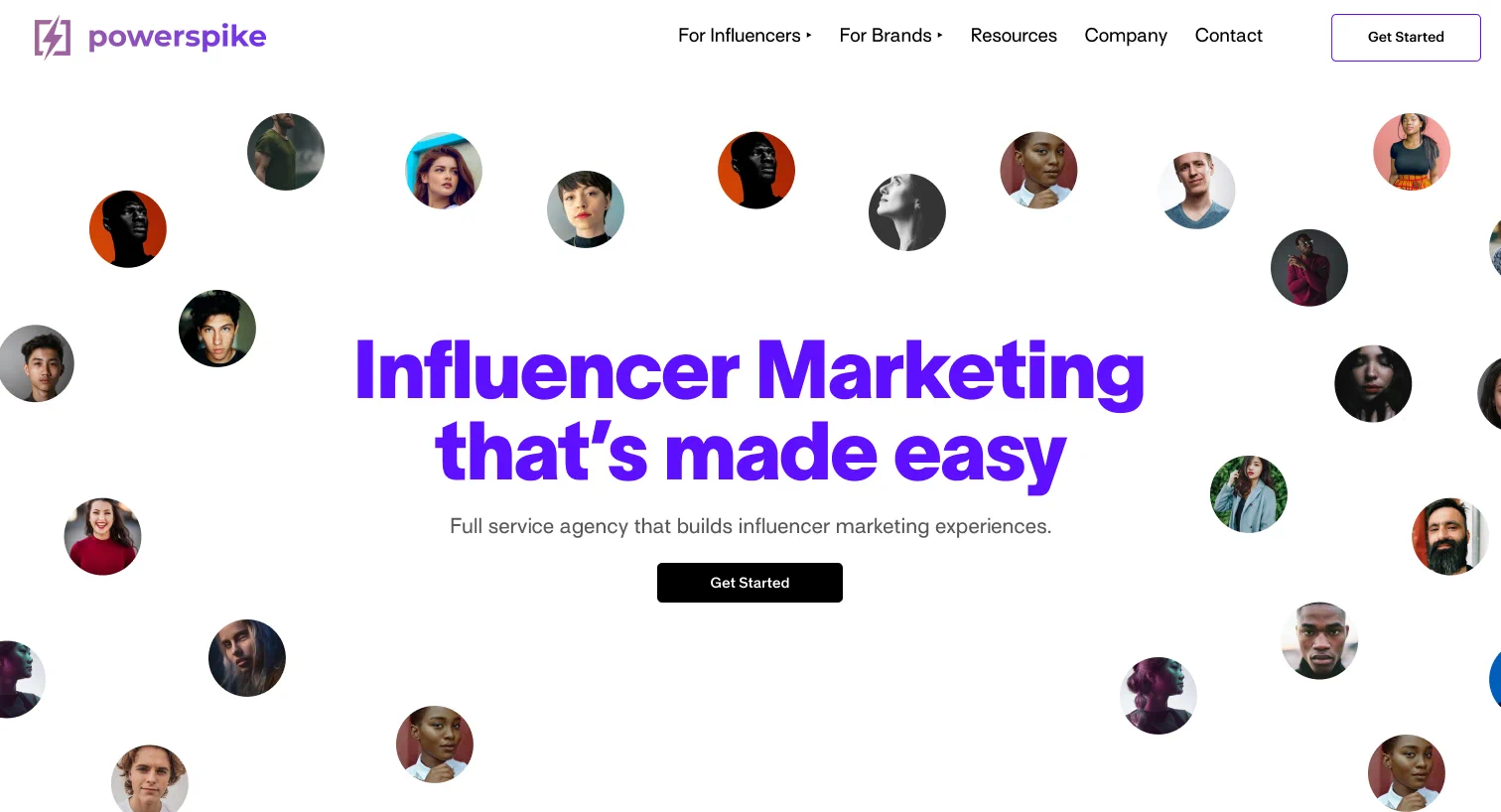
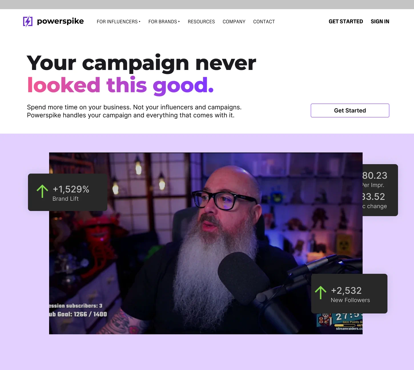
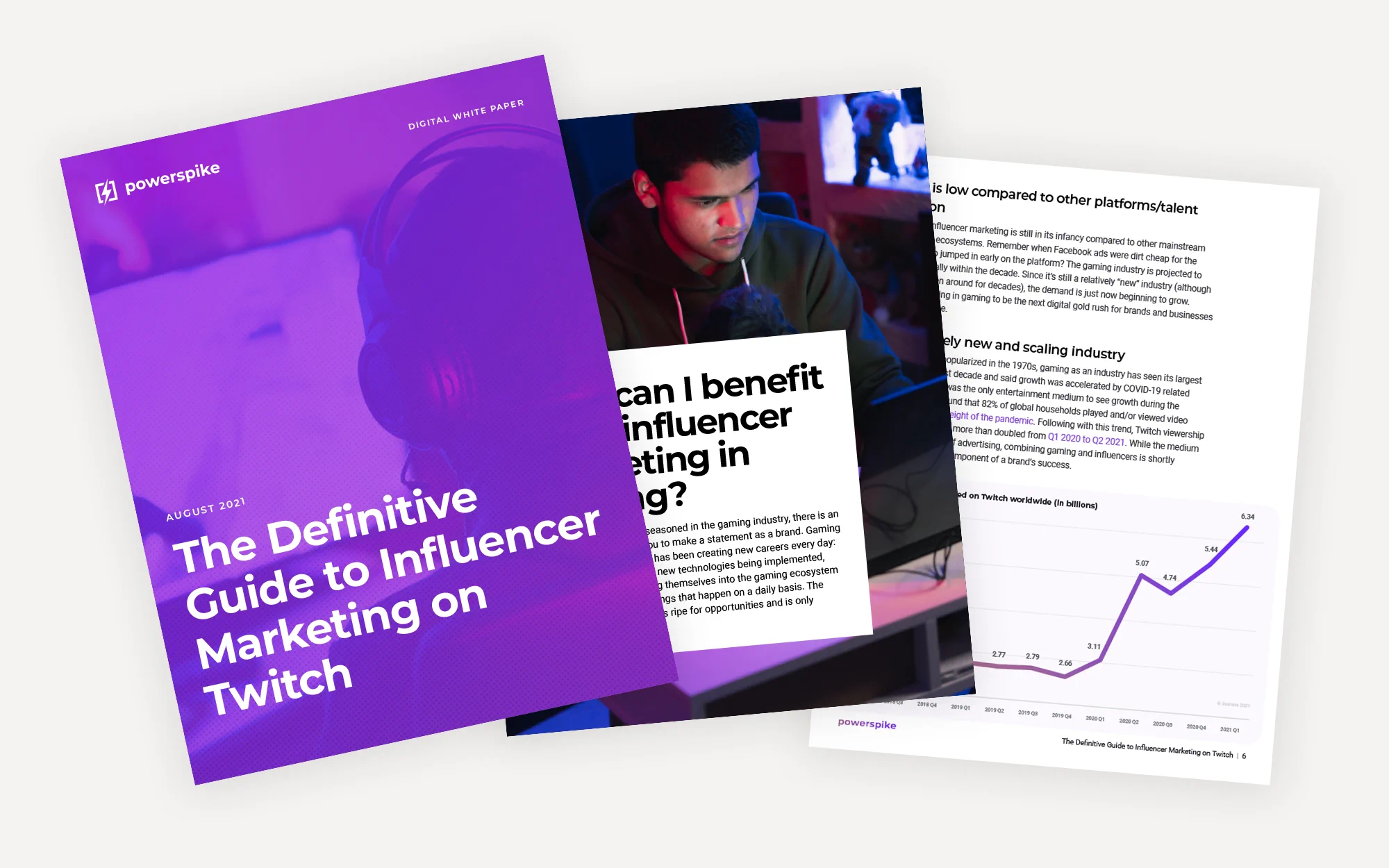
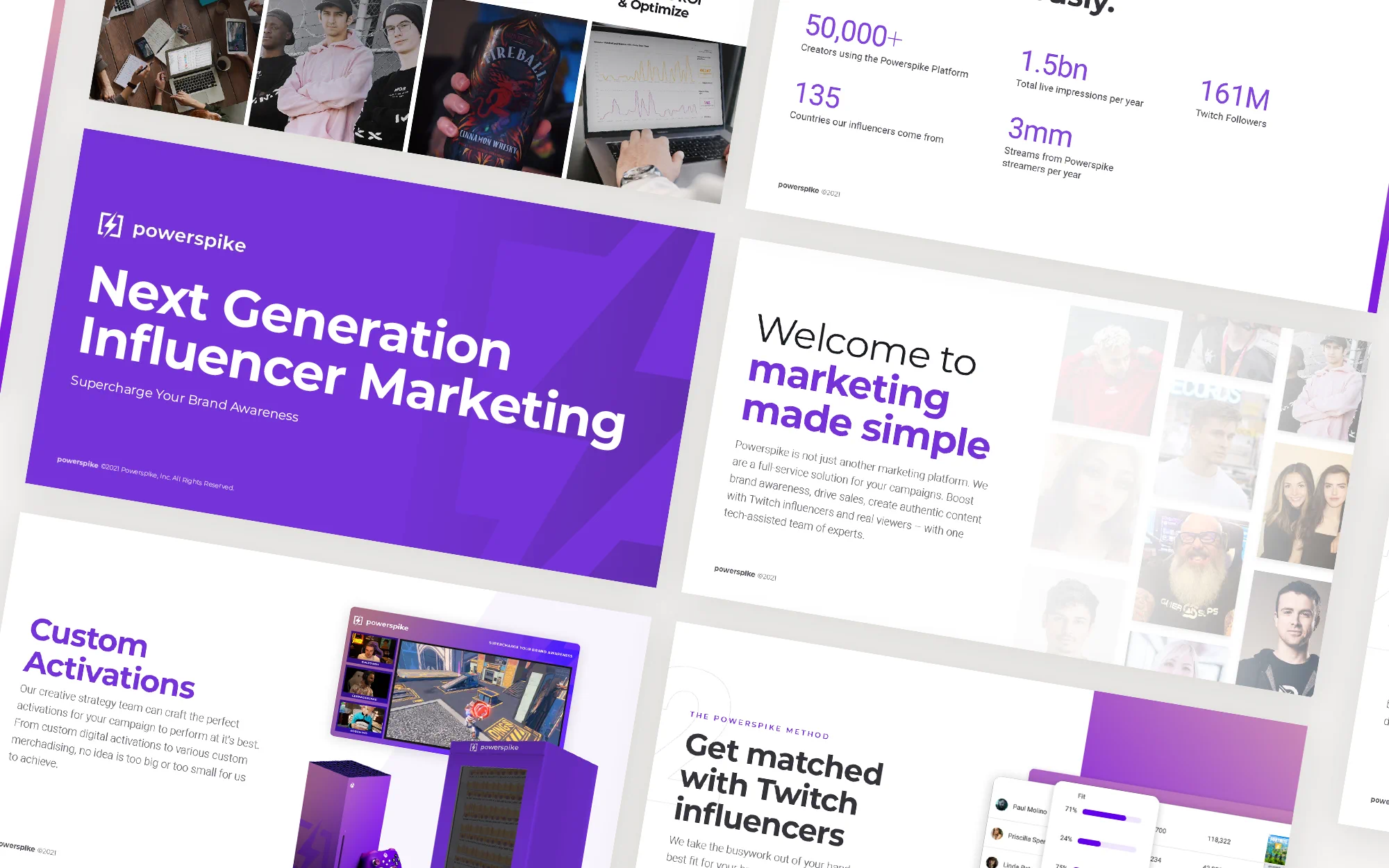
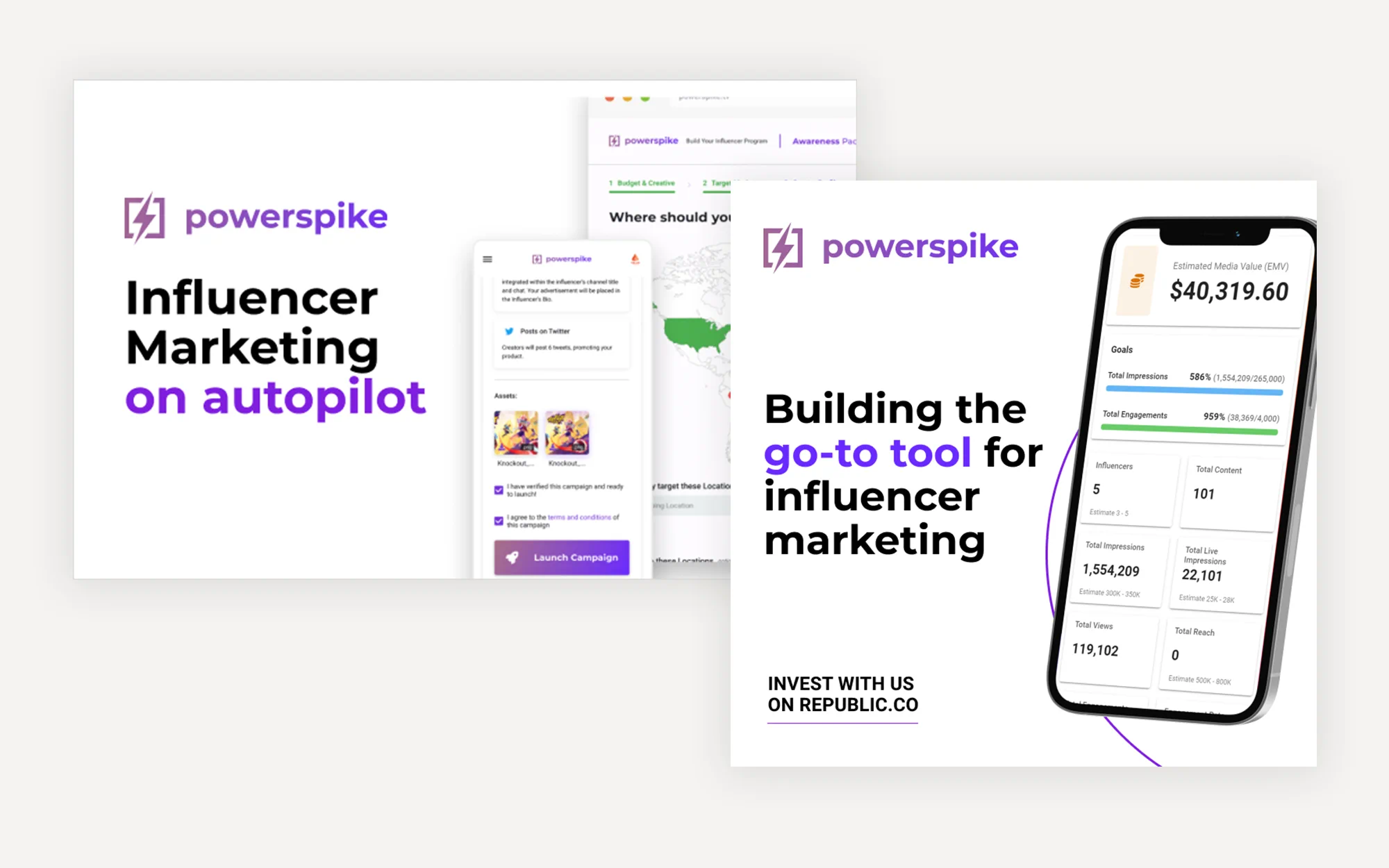
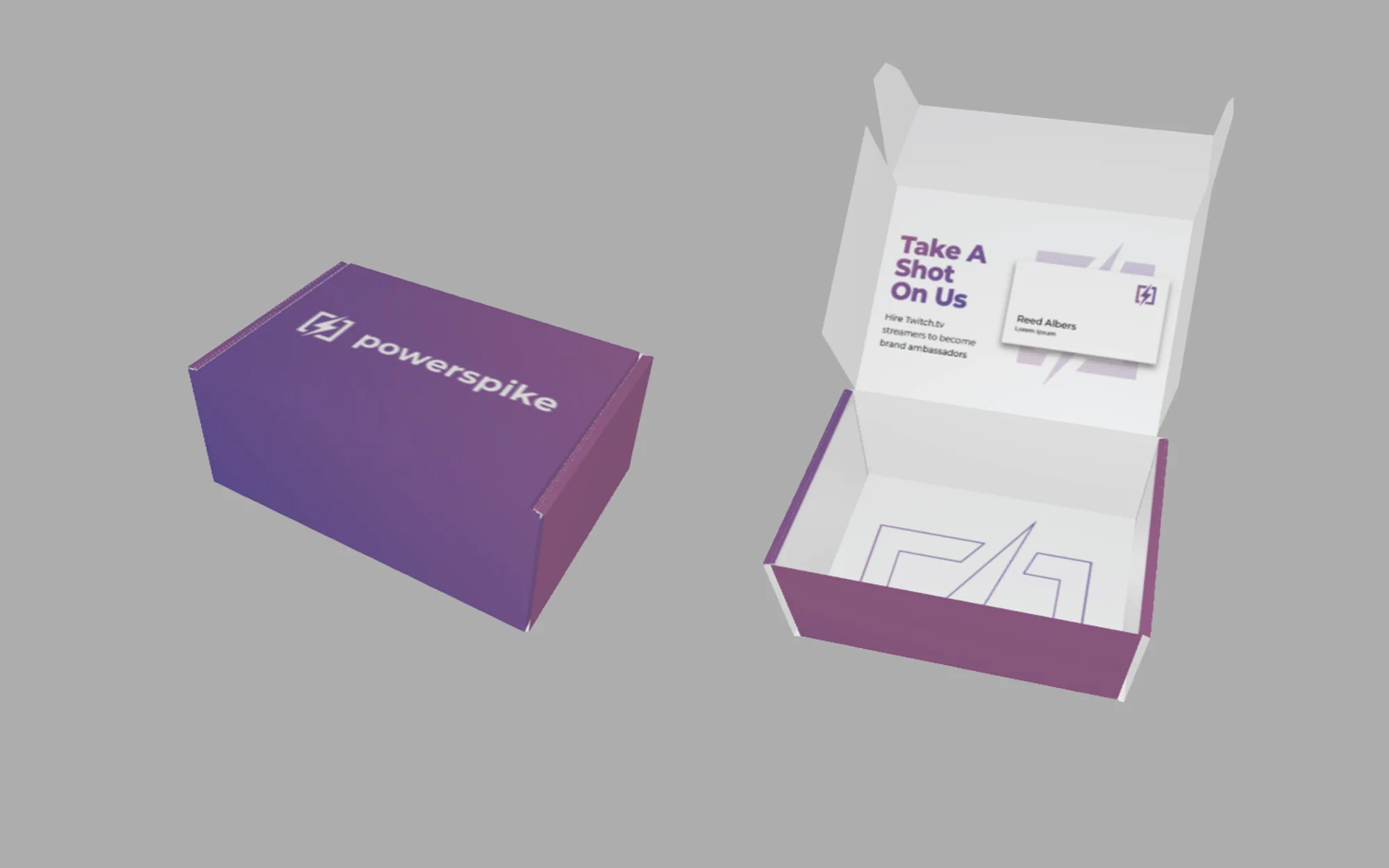
The brand components were set and the core foundations were aligned. All there left to do was to put the brand on everything we could think of (within reason, of course). Landing pages, display ads, downloadable reading materials, pitch decks, you name it, it had the Powerspike purple and a lightning bolt on it.
There was a fair mix of promotional and internal materials made for the Powerspike brand. Some days were focused on capturing new leads through promotional marketing, and some days consisted of RFP and client pitch decks. Over the course of two years we had created dozens of promotional materials and hundreds of presentations and decks—we averaged 2-3 a week, if not more.
Over the course of those few years, a design system and brand guide had naturally formed. Everything was already on brand thanks to the strategy and foundational steps taken prior, but we had found that it finally needed some more rules the more people worked with the brand. It was clear that the system we had built was stable and sound.
Client Campaigns
Brand designer by day, creative director by night.
Designing for an agency is a challenge in itself. With it’s startup nature, each day would bring a different set of tasks and challenges that would test (and grow) our abilities and skillsets.
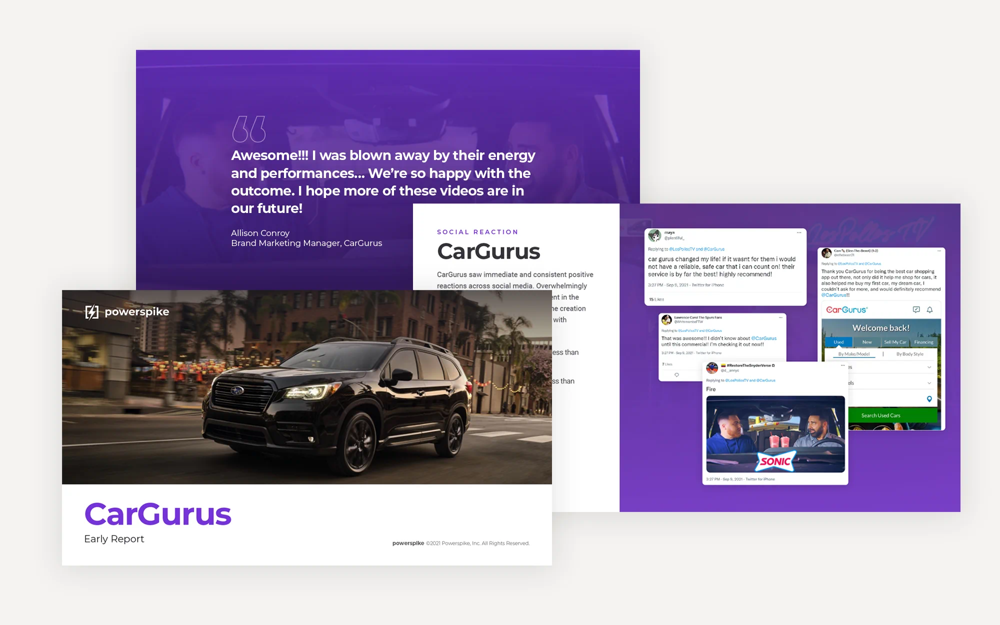
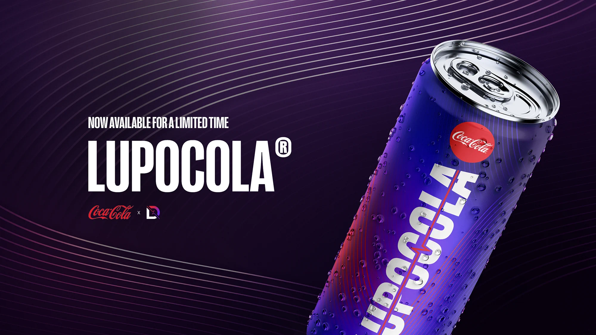
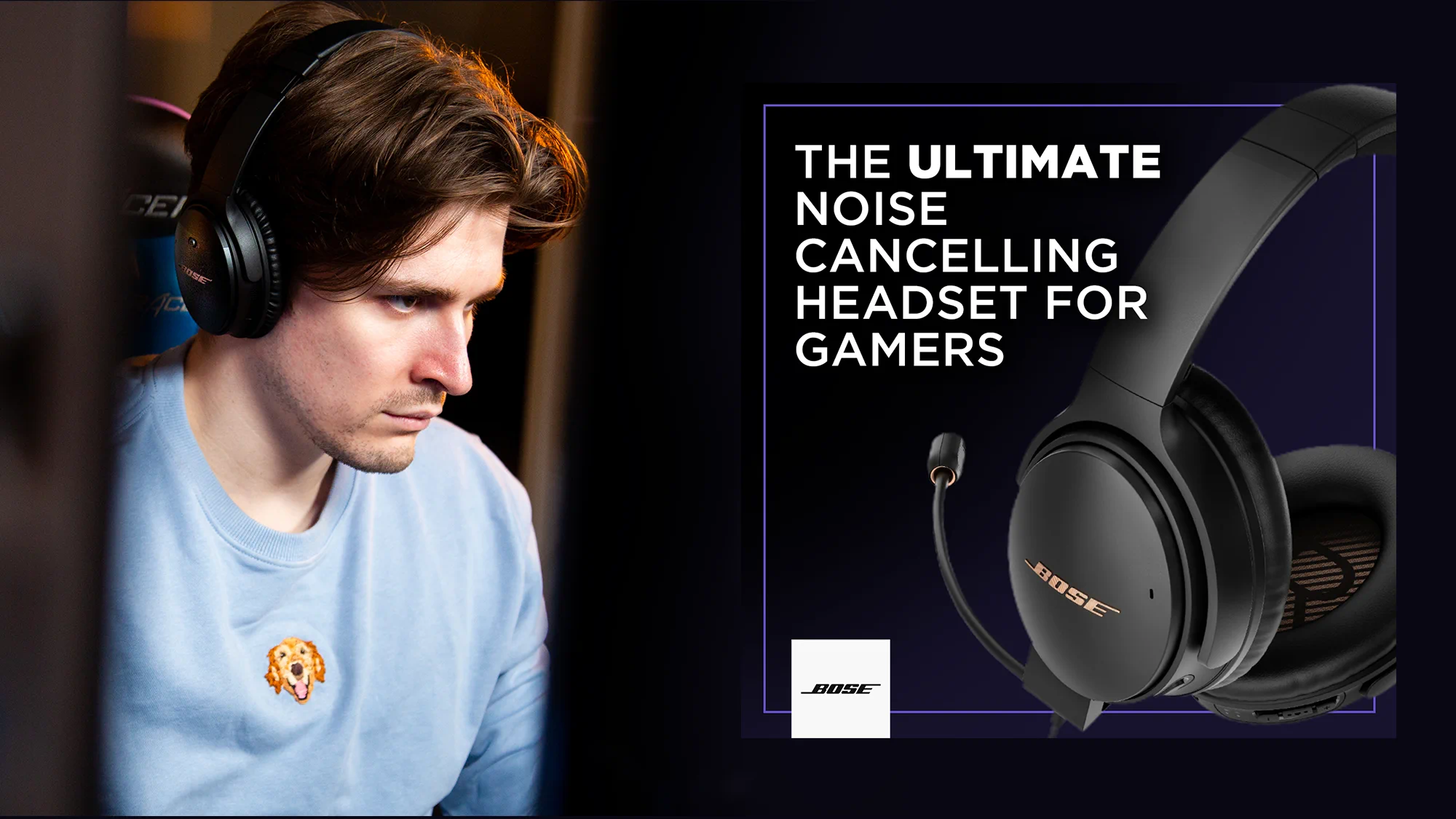
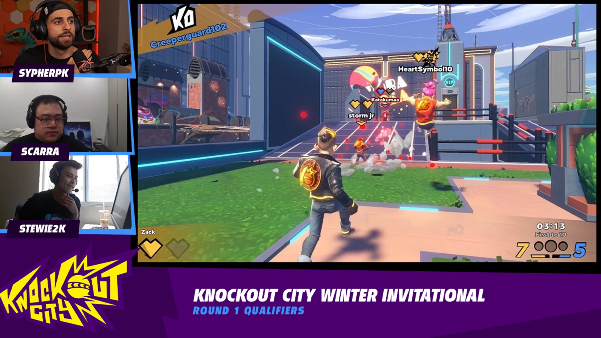
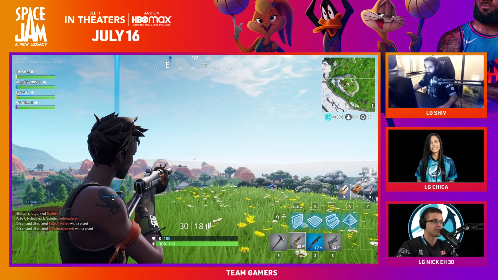
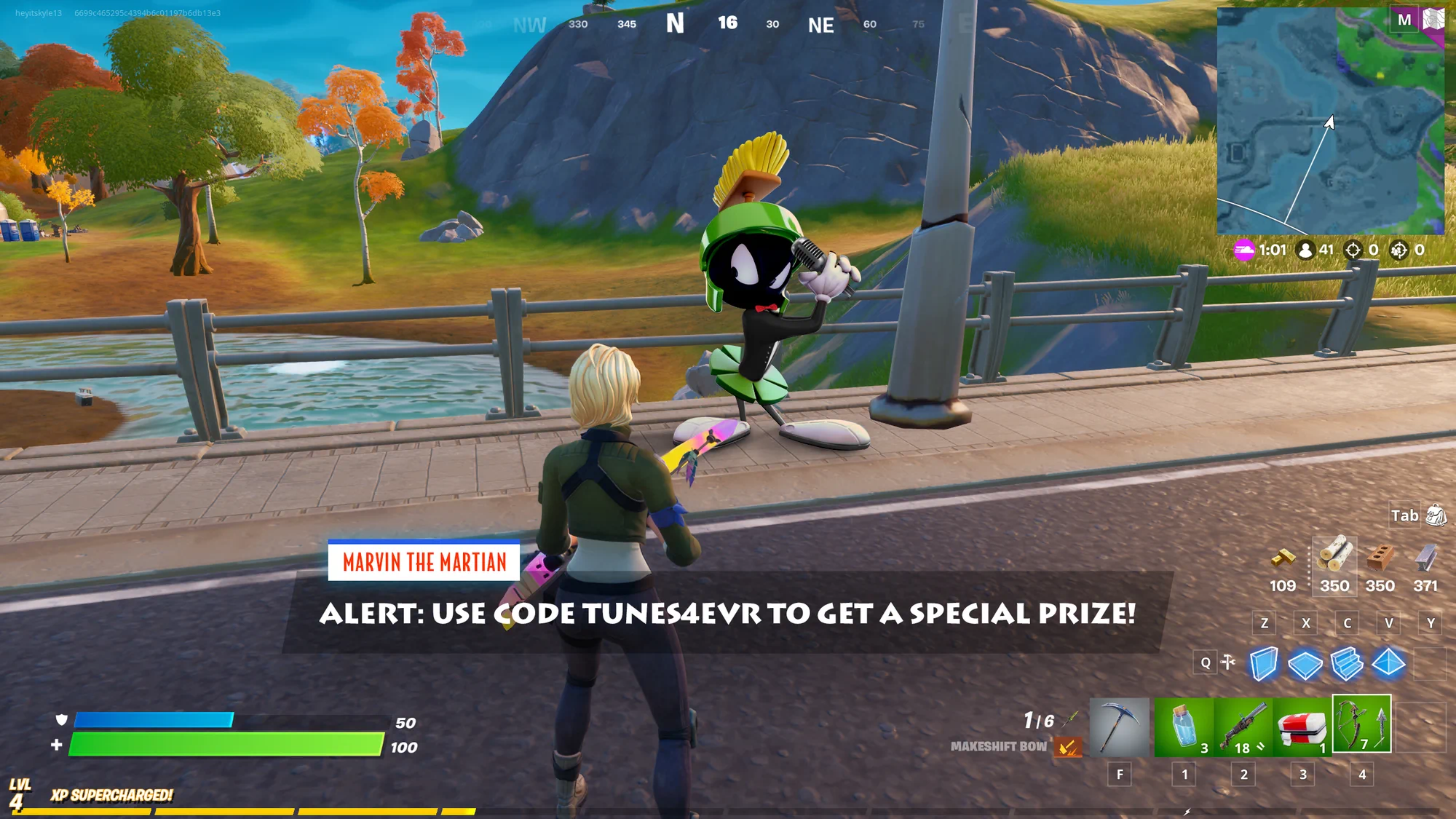
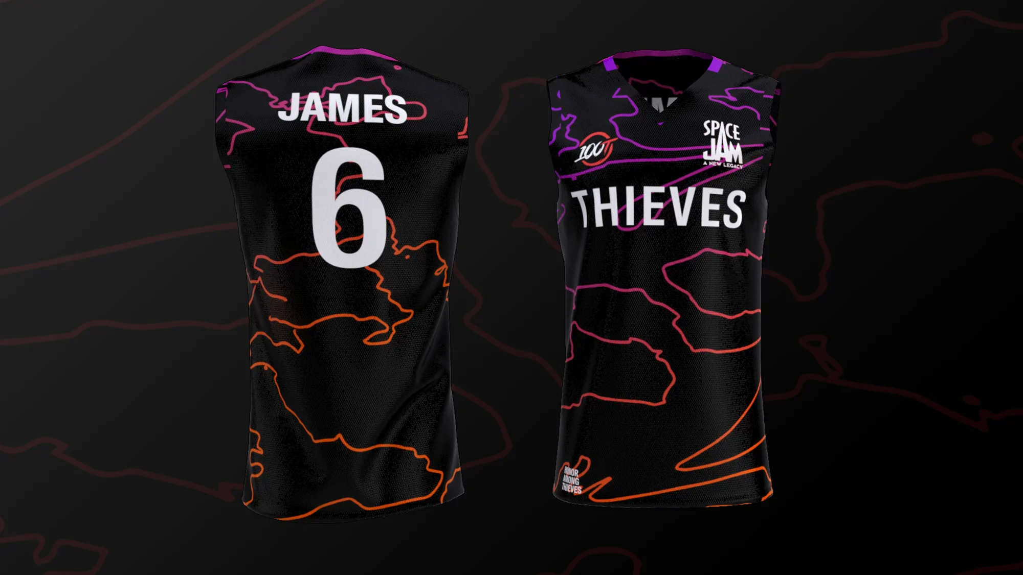
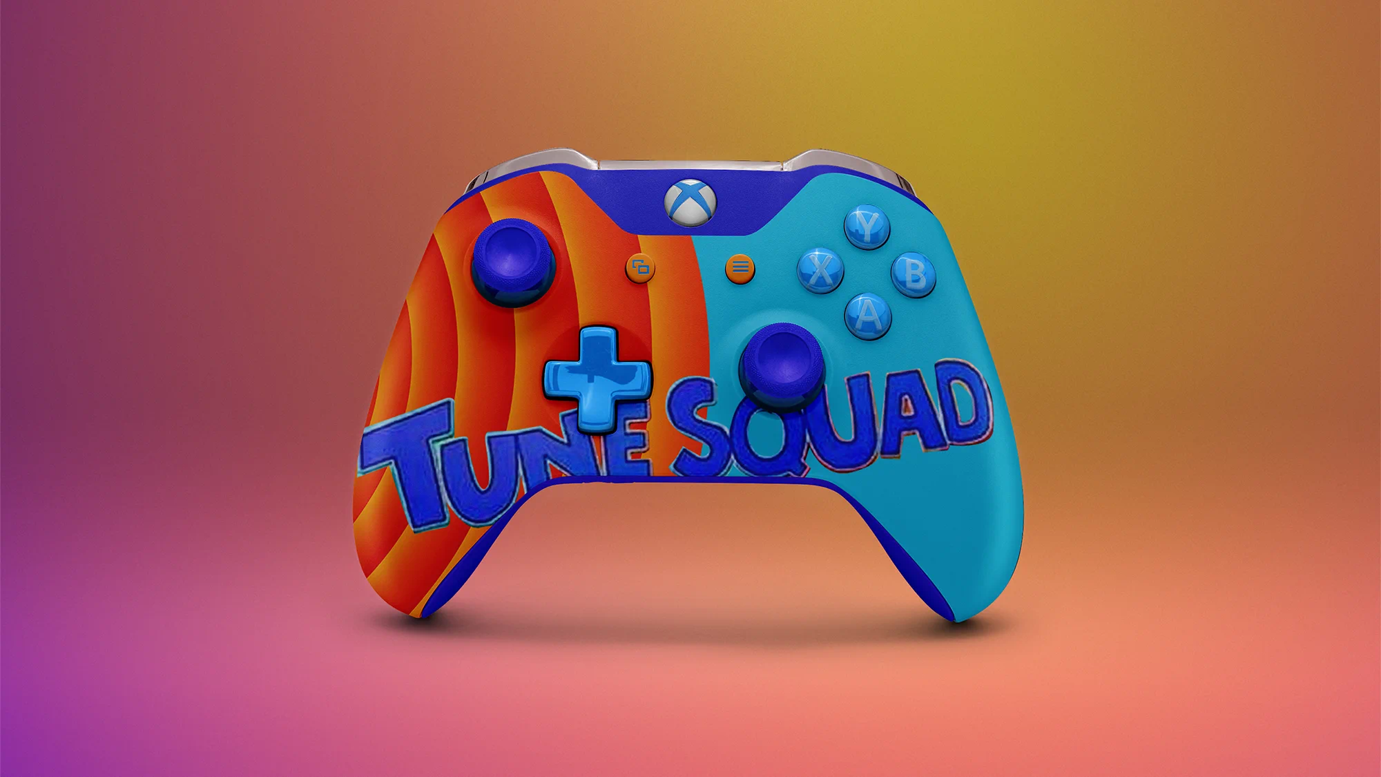
Some days, the focus had to shift from internal brand projects to large scale client campaigns ideation and executions. I worked directly with senior leadership on pitches for major campaigns, brand deals, and they're accomanying activations. Sometimes it was putting the wildest idea we could come up with in a presentation to send to a Fortune 500 company, and sometimes it was carrying through that idea to the actual activation once it was green-lit.
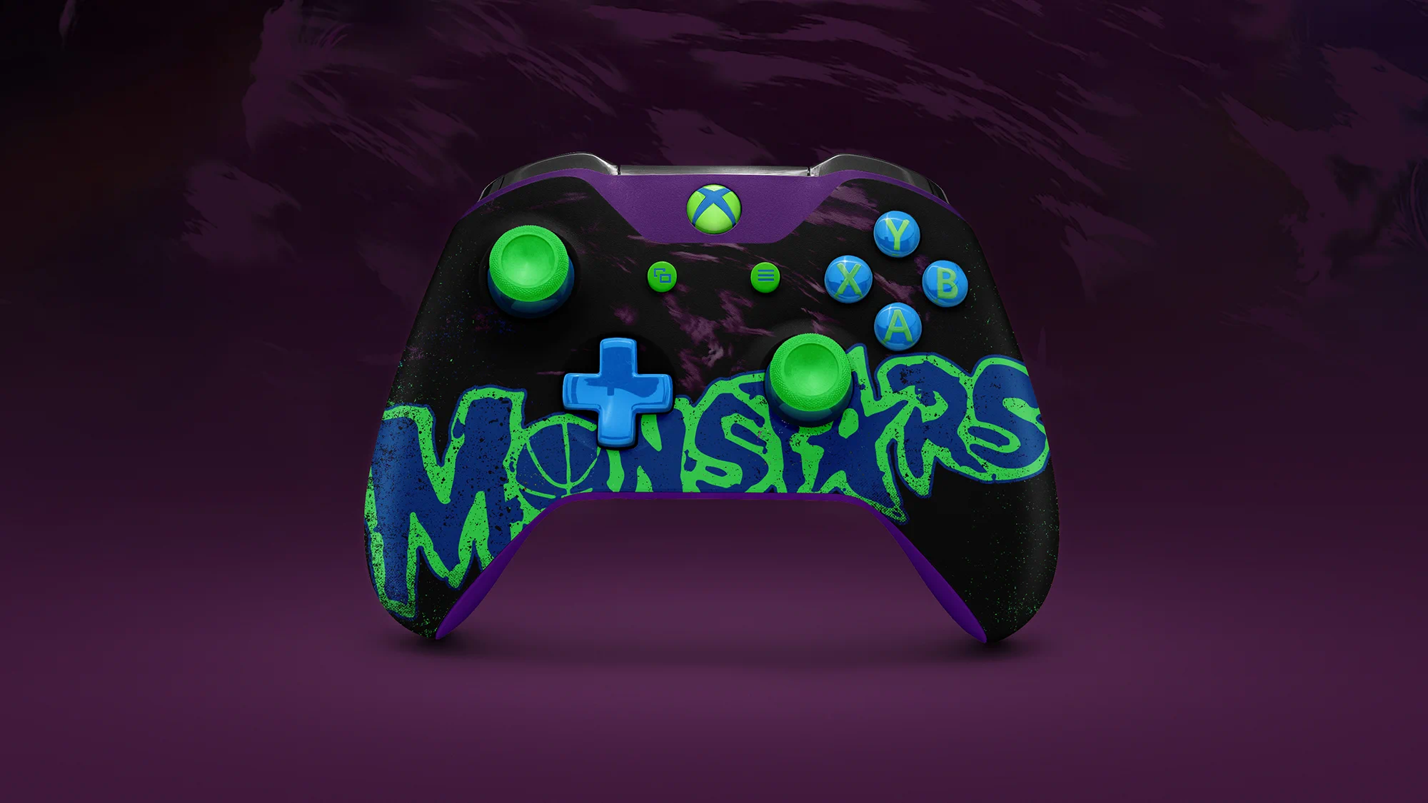
Activations spanned from Twitch ad sets to major video game publishing collaborations to custom merch development. Names spanned from smaller start ups to AAA video game publishers to household name brands like Steve Madden, Warner Bros., and Bose. There was never a dull day when working on a campaign activation.


Creative Operations
Battle-tested systems and creative operations naturally formed as time went on.
Now naturally we can only do so much in a given day, so we had to clearly define how to delegate our work to others and vendors to maintain the client’s brand image when we we're met with our own limitations. It also meant we needed to set up systems to lean and rely on.
As a by-product of working in a spontaneous and ever-changing landscape, templates, processes, and systems were formed to become more efficient. I was responsible for documenting and managing both the creative systems we've built, as well as the "back of house" items like vendor lists, printer relations, creative pricing, and creative SOPs. I worked directly with the COO to ensure a smooth rollout to existing and new team members as the company grows.
Some of the major additions I set up and managed included a comprehensive company wiki and documentation center created in Notion, and a scalable project management system for both internal employees and external vendors through ClickUp.
Reflection
Create your own luck.
Working with Powerspike was a very valuable experience. Between learning the ins and outs of gaming advertising, photoshopping the most obscure idea you can think of, and switching between the designer and director hat, a lot was learned and accomplished.
Start ups are not for the faint of heart. But for the people who yearn for autonomy and don't mind the risk to reward ratio, it's a great fit. Now that's not to say that there weren't rough or challenging days. That's part of the deal.
When given autonomy and the room to fail (and inversely, room to succeed), it truly comes down to how you approach your days and the mindset with each challenge faced. It teaches you when to ask for help and when you need to push past your limits. Working with Powerspike definitely meleft a better and stronger creative than when I had entered.