Hold tightHi there!
 
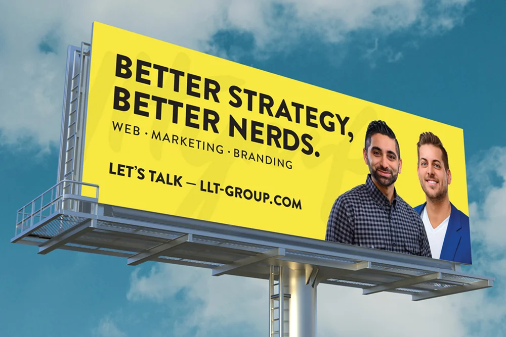
A bright yellow billboard advertisement against a blue sky featuring the text "Better Strategy, Better Nerds" with taglines for web, marketing, and branding services, including two professional headshots and a call-to-action URL.
Case study

LLT Group

A non-traditional approach to designing and branding an agency

Overview

3000000+

OOH Impressions

5

brand touchpoints unified

300+

hours of designer time returned to client work annually
client
LLT Group
role
Brand Designer
timeline
2019-2021
outcome
Full brand system built from scratch: logo, guidelines, voice, environmental graphics, campaign production, and a company podcast.

Background

LLT Group is a digital agency based in Naperville, IL. I was brought in as their dedicated in-house designer with a clear mandate: build the agency brand. They had a functioning business and real clients. What they didn't have was a comprehensive visual identity or the design infrastructure to maintain one.

Problem

Agency design work was being neglected due to client work.

The agency had a look and feel already. What they didn't have was someone always able to work on the needs of the agency; It was given to whoever had bandwidth at the moment. Understandably, the client work took priority. This led to awkward delivery timelines or strained output from the designer who was available to hop on or pick up the project.

Pair this up with minimal project management and piece-meal documentation, and you have a recipe for chaos and incosistency for the brand.

Organizational flowchart showing traditional agency staffing structure with three designers on the left connected to seven work assignments on the right, including client projects, website updates, social media posts, pitch decks, and brand guidelines.

Solution

A dedicated, in-house designer with a singular client: the agency.

These issues compounded over the years LLT had been open prior to my arrival. My role was to become the dedicated creative to ensure consistency and predictable delivery timelines. My only "client" was the agency itself—an unorthodox (yet, welcome) approach to the roles found within agencies.

A new role was created specifically for in-house, multi-disclipinary creative tasks for the agency itself. This allowed the designers who were on client projects focus on what kept the lights on and took the additional task (and stress) off their plates. Operationally, a win-win scenario.
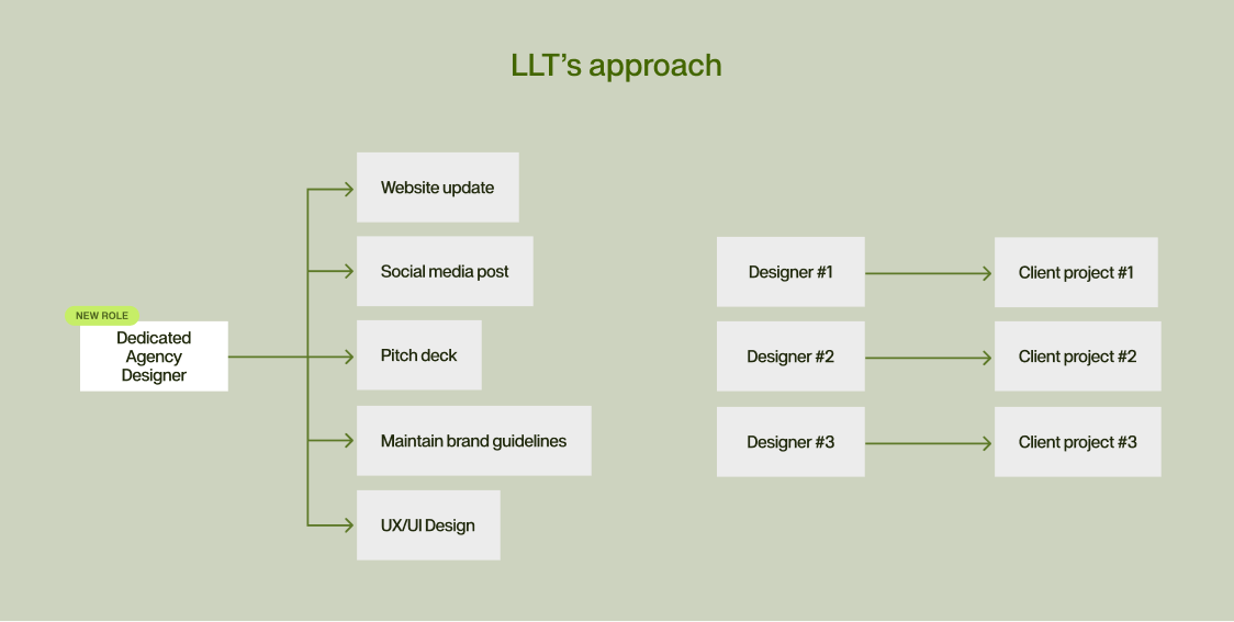
A flowchart diagram illustrating LLT's approach, showing how a dedicated agency designer manages multiple tasks like website updates and social media posts, which are then distributed to three designers who each oversee corresponding client projects.

Brand Foundations

Aligning the brand and setting some ground rules.

With a newly founded and dedicated agency designer, the role was to learn, devise, and develop a cohesive brand for the agency at large.

Initially, I need absorb as much information as possible to get the current standing of how (and more importantly, why) are made within the agency. This meant carrying business on as usual before overhauling anything. It quickly become clear on what areas needed the support and structure, and what missing gaps needed to be answered.

This included everything from logo design to brand guidelines to the brand's tone of voice to ensure that their image was in line with what they do.
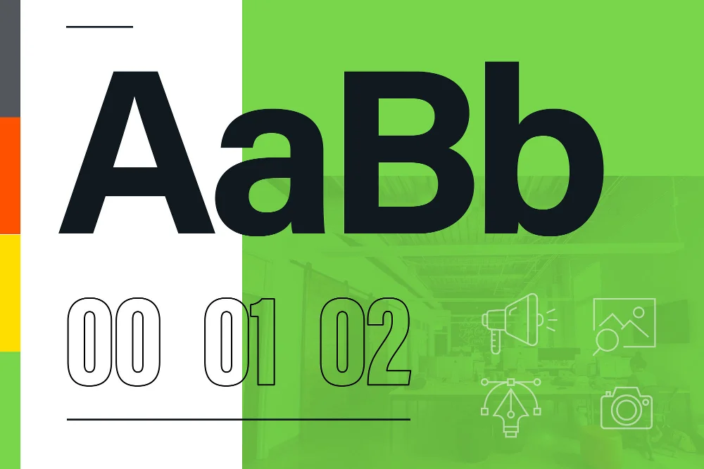
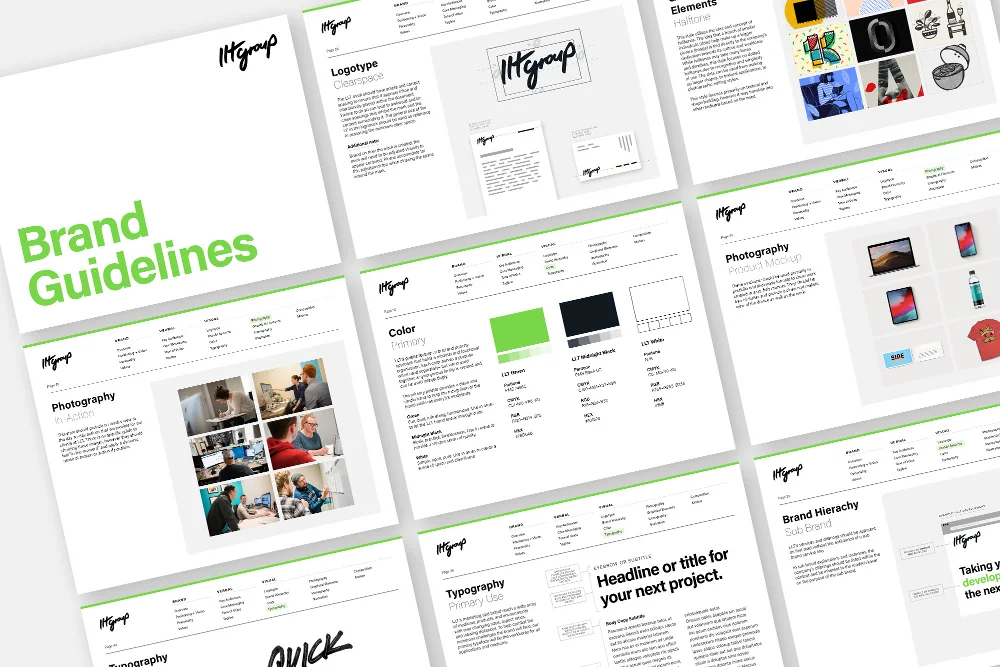
A style board displaying typography and branding elements featuring large "AaB" letterforms in black and green, numbered sections "00 01 02," and minimalist line icons of design tools on a split white and lime green background.A comprehensive brand guidelines document displayed across multiple pages showing logo usage, color palettes in green and black, typography specifications, photography styles, and design system components for consistent brand implementation.
Brand guidelines
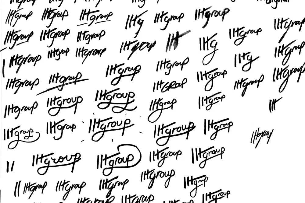
A collection of handwritten logo sketches and variations for "LLT Group" displayed in black ink on white paper, showing multiple iterations and styling options for brand identity development.
Initial sketches of selected direction
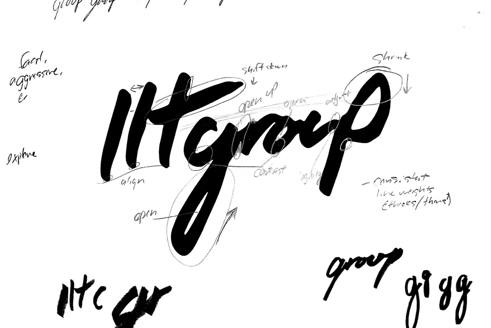
Hand-drawn logo sketch for "llt group" with handwritten annotations and directional notes, featuring bold black brushstroke lettering on a white background with design refinement markup.
Refinement of selected sketch
Final logo with animation

Design Outputs

Working with the new brand

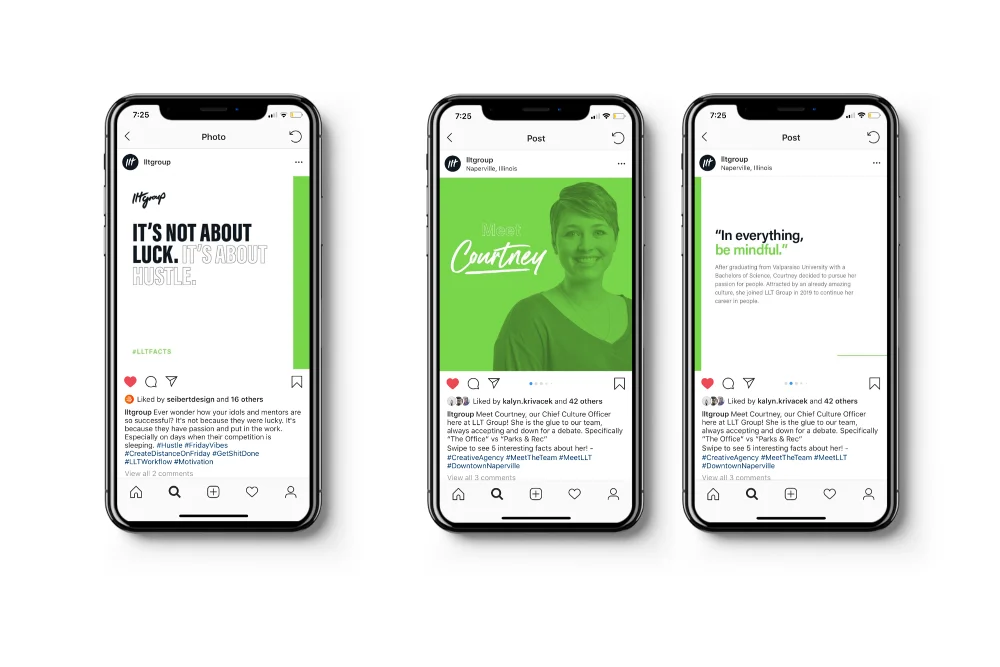
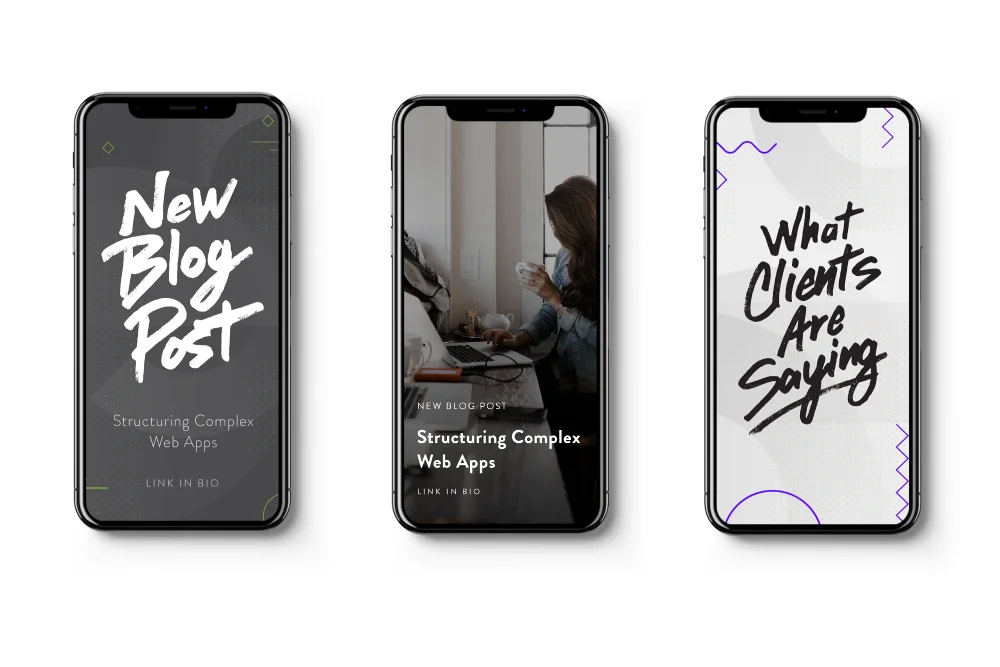
After establishing the core visuals and refining the brand's creative components, it was time to start building items to show and promote the new look. The first batch of items were varied and traffic-focused, ranging from billboards to webpages to social media campaigns. The goal here was to work quickly and efficiently thanks to the brand guidelines that were established.
A bright yellow billboard advertisement against a blue sky featuring the text "Better Strategy, Better Nerds" with taglines for web, marketing, and branding services, including two professional headshots and a call-to-action URL.
Billboard design (as seen on local Chicago interstates!)
Three smartphone mockups displaying a social media series with green-themed post designs featuring typography, portrait imagery, and engagement elements like likes and comments in a modern mobile interface layout.
Templated social media assets - Posts/Carosels
A set of three mobile phone social media templates displaying hand-lettered typography and lifestyle imagery, designed for Instagram Stories or similar vertical social platforms with 2000x1333 pixel dimensions.
Templated social media assets - Instagram/Facebook Stories
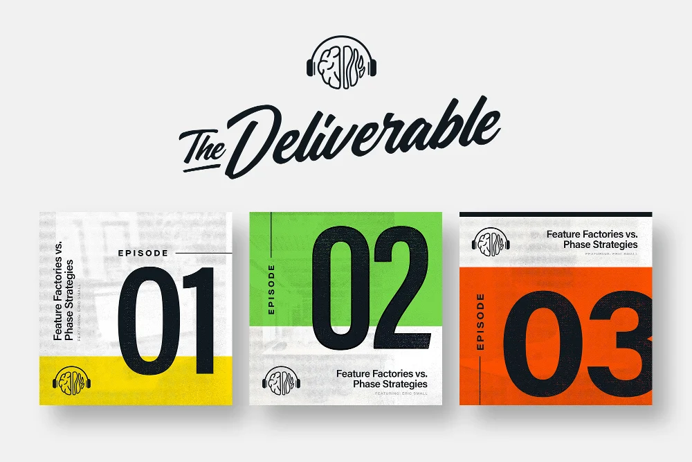
Podcast cover page for "The Deliverable" featuring three episode cards numbered 01, 02, and 03 with a modern design aesthetic using bold typography, bright accent colors including yellow, green, and orange, and a circular logo stamp at the top.
Sub-branding & design for the company-produced podcast
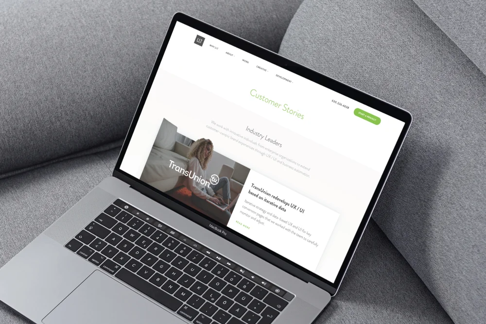
A laptop displaying a customer stories webpage with a clean, minimal design featuring a hero image, testimonial content, and a green call-to-action button, positioned on a gray fabric surface in a professional mockup style.
Web design for new areas of the agency website

Cultural Items

A brand is more than just it's logo.

Beyond the high-visibility items, it was also important to shift focus to more cultural and evergreen materials. This included creating and strategize on more "fun" items such as seasonal apparel releases, video production, and even developing a company-hosted podcast!
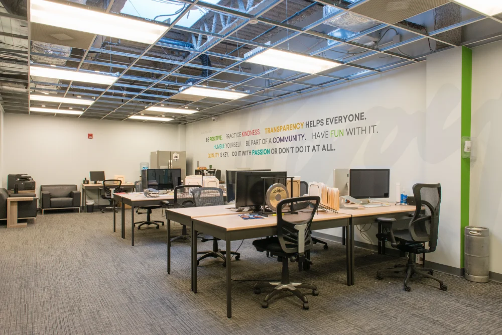
A modern open-plan office workspace on the third floor features collaborative work tables with ergonomic chairs, computer monitors, and storage units beneath an exposed industrial ceiling with skylights and fluorescent lighting, with motivational text on the back wall and a green accent column.
In-office photography + wall mural design
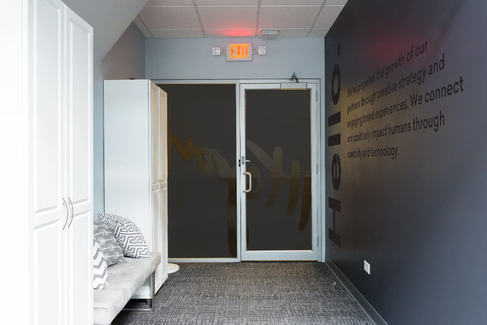
Interior view of a third-floor entry door with white frame and dark glass panels, flanked by a white cabinet on the left and a dark accent wall with text on the right, featuring a tiled floor and exit sign overhead.
In-office photography - wall mural design + window wrap
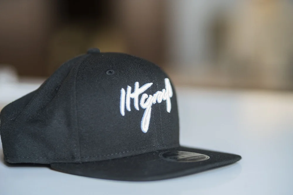
A black snapback cap featuring white script branding on the front panel, photographed against a blurred neutral background in product photography style suitable for e-commerce or brand merchandise display.
Company swag with new logo
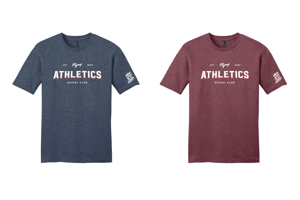
Two athletic t-shirts displayed side by side in navy blue and burgundy, each featuring "ATHLETICS" text with decorative elements and small badge graphics on the sleeves, representing LLT Athletics apparel collection.
Custom swag design and printed for team sports outings

Media

It didn't stop at the designs

While creating the brands assets and items, auxillary needs began to pop up. The most notable need was photo and video media. Working with the agency's creative director and media specialist, I also shot video and photo of the office for various uses across mediums. With such a cool office, it was impossible to not show it off.

As new initiatives came in, photo and video needs also came with them. This meant supplying media for the cultural design outputs. Key areas were the company podcast and the company-branded merchandise.

B-roll video of office
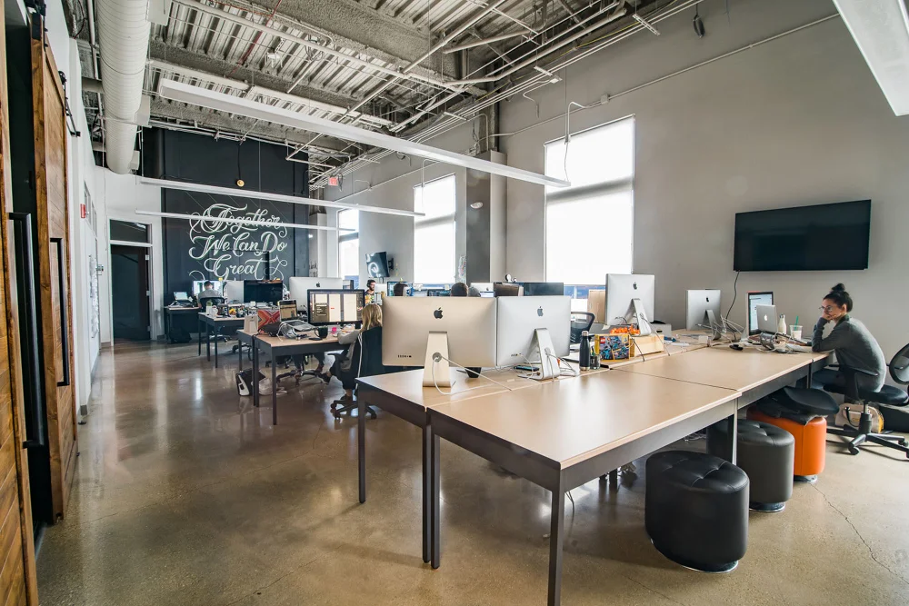
An industrial-style office or creative workspace featuring exposed ceiling ducts, sliding barn doors, a large work table with storage underneath, chalkboard wall signage, and natural light from windows, captured in a horizontal landscape format suitable for workspace documentation or office design portfolios.
Office photography
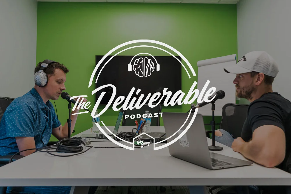
Two male podcast hosts sit at a desk wearing headphones during a recording session for "The Deliverable Podcast," with a neon-style logo and green wall backdrop creating a modern studio environment.
Photo media for company podcast
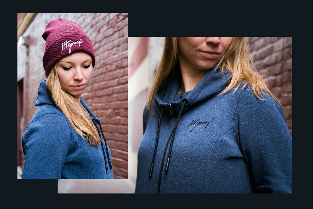
A product showcase featuring branded apparel including a burgundy beanie and blue hoodie displayed on a model against a brick wall background, styled as merchandise photography for brand promotion.
Photoshoot for company-branded swag