Boundless
Unifying a healthcare agency, one business unit at a time.
Overview
6
45
400+
Acquired
Background
Boundless Life Sciences Group is a full-service life sciences marketing agency built to break down barriers for pharmaceutical and healthcare brands.
Spanning capabilities such as AI, strategy, and commercial consulting to medical communications and strategic creative, Boundless operates as a single, integrated partner across every phase of a brand's lifecycle—from molecule discovery to market maturity.
Problem
With a growing portfolio of business units operating under one roof, the brand needed a visual system that could hold it all together.
Boundless wasn't a single-service agency—it was a portfolio of specialized business units, each with its own team, leadership, and P&L. However, the agency's branding wasn't showing it. Business units lived as bullet points, no distinct identity, and no sense that a client would have a dedicated, expert team behind them. For prospects evaluating agencies in a high-stakes, high-volume industry, the brand was underselling the operation at every touchpoint.
The positioning Boundless needed already existed internally. It just wasn't visible anywhere.
Solution
Give each unit a voice. Keep them in the same room.
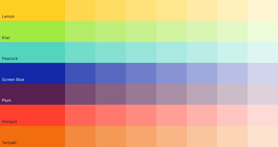
The solution was a branded house system — one agency, six distinct business units, each with its own visual identity that stayed legible within the larger Boundless framework. Every unit received a dedicated colorway pulled from a purpose-built palette of 70 colors across 7 hue families, chosen to reflect the unit's specialty and the emotion it needed to evoke. Digital and AI got a vibrant blue — a nod to early computing. Print got magenta. Consulting, a deep navy. The color did the differentiating work without breaking from the whole.
From here, a harmonious yet structured system emerged and allowed for clearer direction when we begin building and updating assets.
Crafting the brand system
Breaking down the barriers on traditional agency branding.
Since there was so much to consider with all the moving parts of the brand, a system that could stand the push and pull of its sub brands was necessary. This posed an interesting design challenge: build a system that gives freedom to business units but imposes restriction so the brand is consistent and recognizable at all times.
This resulted in two main areas where the Boundless brand(s) could really shine: Color and Typography.
Color
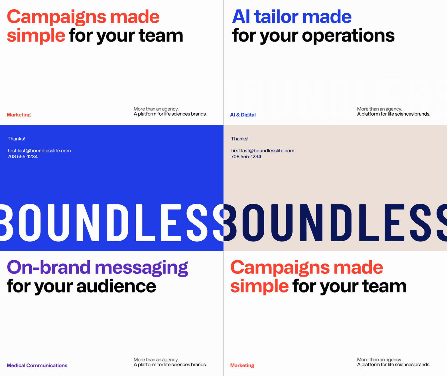
The solution to that challenge was simpler than expected: theming. Lock down the recognizable areas of the brand like typography, iconography, grid/layout, and photography, then allow for each sub brand to drop in their own colorway to make it clear which business unit you were looking at. This approach made for an easy to apply creative equation of sorts: base agency style + business unit colorway = sub brand. 7 distinct hues were chosen with 10 tints/shades each, resulting in 700 unique colors available to the brand.

Typography
In addition to the expansive color system, the Boundless brand also focused heavily on strong typographic treatment and layout. The core concept of the brand ties back to the name and logo: breaking out of the barriers we are placed within. The Boundless name implies limits are meant to be surpassed, and the logo reinforces that through its super-cropped, negative fill application. It was obvious that the typography needed to follow suit, but the question remained "How?".
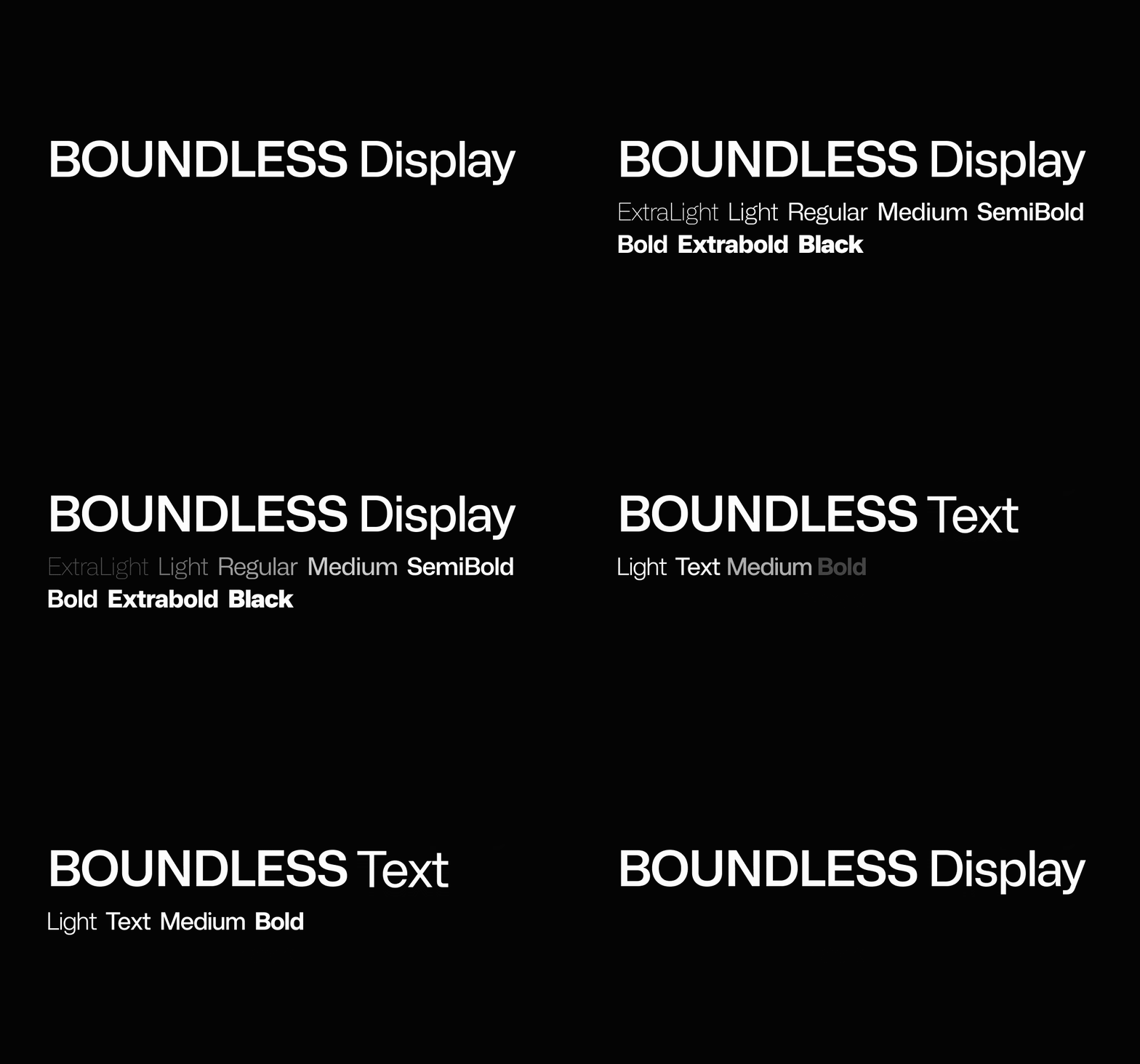
Typography is a dynamic element that conveys both personality and emotion, while also serving a utilitarian purpose. The typeface used for the brand was a custom modification of the open-source font Mona Sans, a technical, yet expressive sans-serif with multiple variable axises. The font was modified to adjust the default set of its stylistic sets, in addition to tweaks and modifications to glyphs to support how Boundless used the fonts.
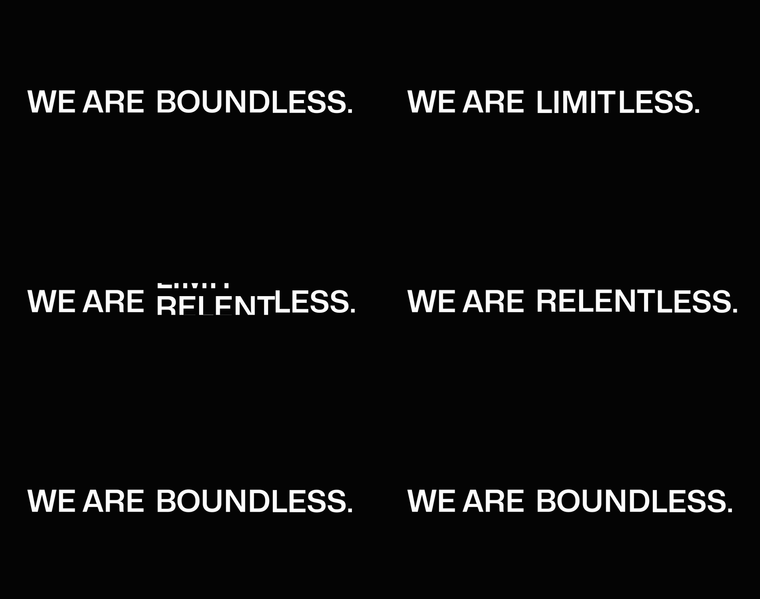
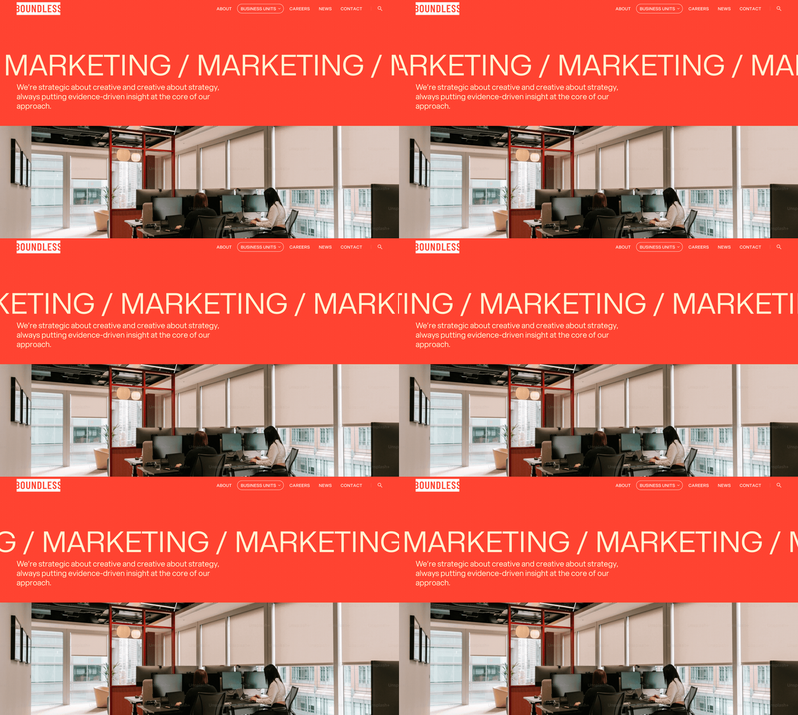
The framing and layout of the typeface is what truly tied it all back together. The concept of breaking barriers allowed for multiple answers to a singular question "How can this text break out of its container?". This could be pulled through in a multitude of ways, regardless if it was a website or a business card. Most notably the "odometer" and "marquee" effect took place in areas that allowed for motion, and super crops were applied in areas where it must be static (such as print and flat imagery).
Website Infrastructure
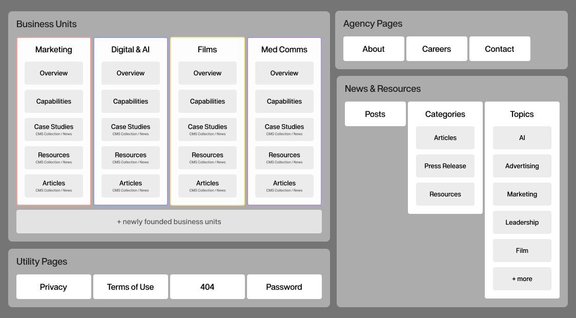
A web of interconnectivity
The agency website originally showcased each business unit as bullet points or small sections hidden within a page. Entire departments reduced to a line of copy. The user never got the idea that each of these "services" was a team of dedicated and high-skilled individuals.
The newly created brand design system gave way to letting each unit truly sing while staying within their proverbial "sandbox". With that, each business unit received its own nook on the website alongside their newly founded sub brand. This was a core part of the website's information architecture so the scaffolding needed to ensure it could support the growth and influx of content, whether directly tied to or related to the business unit.
The website was built on Webflow, a visual web development platform that bridges creative with low/no-code environments. Webflow was selected due the ease of use, speed of which a team could update information, and the most crucial portion of it all, their CMS. The Boundless website heavily utilizes CMS collections to support the cross pollenation of content via logical relations. The result? A web of interconnectivity between agency information, news, and capabilities that self sustains itself every update.
Website Design
Pulling it all together digitally.
The infrastructure of the website was only half the battle. The other half was now pulling all of the prep, ideas, and systems together into a visually harmonious system online. The agency's website was the first major stress test for the brand, and many other assets followed suit after its launch.
Working with the Boundless leadership team, I outlined and coordinated areas where we needed our business unit leaders and subject matter experts to develop copywriting content. While that was ongoing, I was working on pulling in the content infrastructure into clear to navigate design patterns for each section of the site.
The digital medium of the website allowed us to experiment and dabble with motion and interactivity to help support the breaking barriers branding concept. This resulted in large, expressive moving typography in areas that called for attention such as the marquee headlines and odometer-style text rotation effects.